In the high-speed world of modern consumerism, few images are as universally recognized as the Coca-Cola logo. Whether it is etched onto a glass bottle in a small village in the Andes or glowing on a massive digital billboard in Times Square, the flowing, Spencerian script on a vibrant red backdrop is a cornerstone of global visual culture. Yet, despite its ubiquity, a new wave of digital archeology has prompted millions of people to look closer at this 130-year-old design, revealing a “hidden detail” that many claim has been hiding in plain sight for generations.
The Discovery: A National Treasure in a Letter?
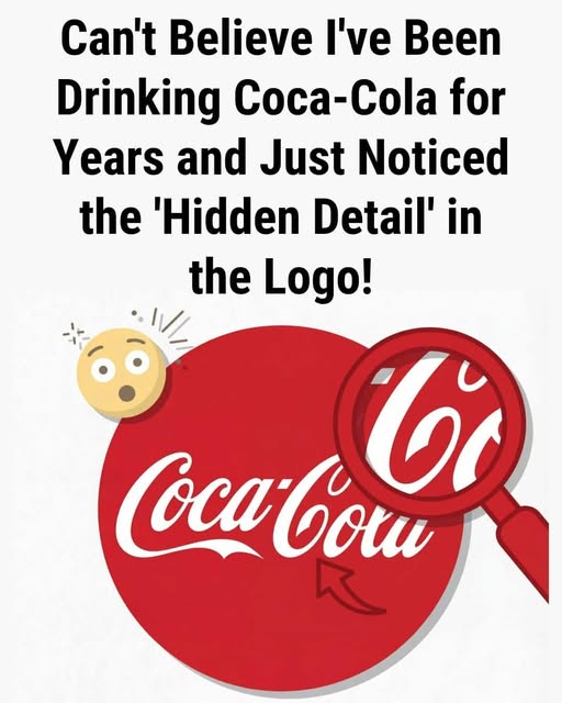
The “hidden detail” that has recently gone viral involves a specific intersection of the letters in the Coca-Cola script. When one focuses on the “o” and the “l” in “Cola,” the negative space and the overlapping flourishes create a shape that many identify as the Danish flag (the Dannebrog).
This discovery first gained significant traction during a marketing campaign in Denmark, where the company leaned into the coincidence. While most design historians agree the “flag” was likely an accidental byproduct of the script’s curves, its discovery highlights a powerful phenomenon in branding: the ability of a design to transcend its original intent and take on new, localized meanings.
The History of the Spencerian Script
To understand the “hidden” elements of the logo, one must look back to 1886. The logo was not created by a high-priced design firm, but by Frank Mason Robinson, the bookkeeper for Coca-Cola’s inventor, John Pemberton.
Robinson suggested the name “Coca-Cola,” believing that “the two Cs would look well in advertising.” He chose Spencerian script, a style of penmanship that was the standard for business correspondence in the United States during the late 19th century.
Why the Design Endures:
- Humanity: Unlike modern, sterile sans-serif fonts, the hand-drawn nature of the script feels personal and “friendly.”
- Contrast: The stark white against “Coke Red” creates an immediate psychological trigger of energy and refreshment.
- Consistency: While brands like Pepsi have undergone dozens of radical redesigns, Coca-Cola has remained remarkably consistent, building what experts call “perceptual fluency.”